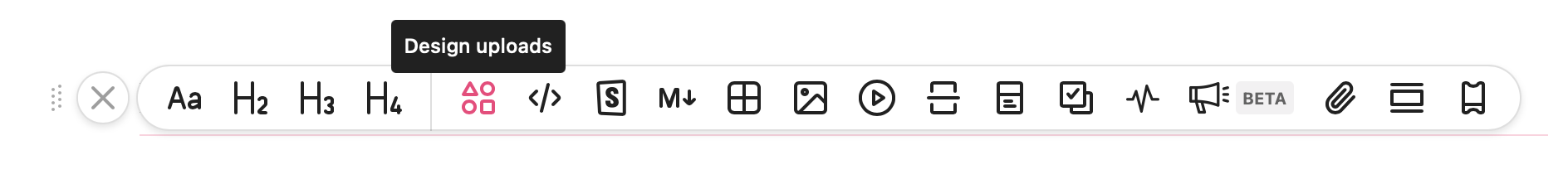
Blocks
Brienne Wong
When you start off with an empty page in zeroheight, you can select from many different blocks to build up your documentation. The below gives an explanation as to what each of the different blocks mean and how to use them in your design documentation.

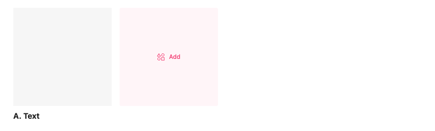
Text
Paragraph
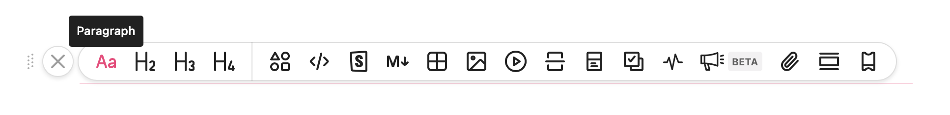
Paragraph blocks are used for the typing of text blocks. You can also write in markdown.
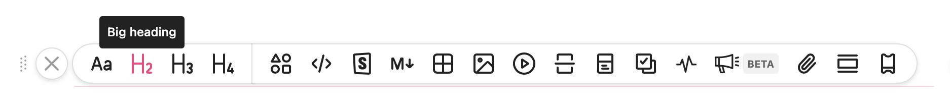
H2 – Big heading
Big headings are H2 headings.
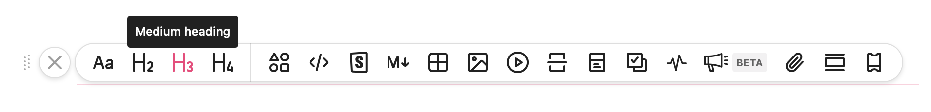
H3 – Medium heading
Medium headings are H3 headings.
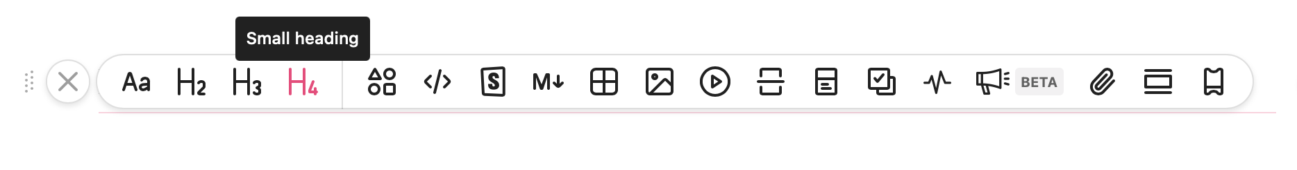
H4 – Small heading
Small headings are H4 headings on the page.
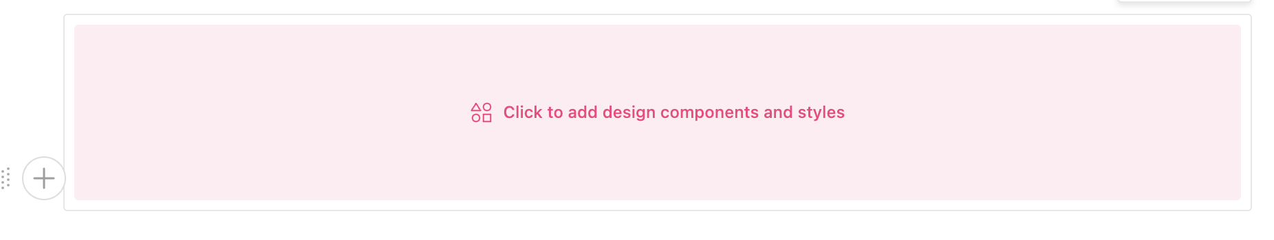
Design
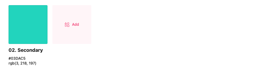
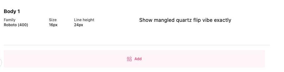
Design upload blocks are used to upload design components, frames, and styles including color swatches and typography. These are taken from the design files that you’ve linked or uploaded, so can come from a variety of design tools including Sketch, Figma, and Adobe XD.
👉 Note: You can manually arrange your design uploads within the design uploads block in whatever order you want.
There are three styles of design upload blocks for color swatches, typography, and design uploads as shown below.
Color swatches:
Typography:
Design uploads:
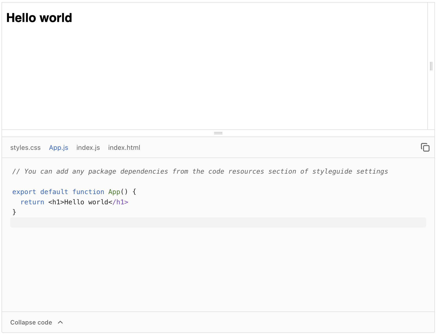
Code
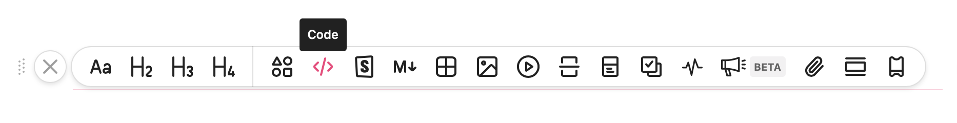
Code blocks open up the possibility for various types of code to be uploaded in different ways.
You can either render code live, in frameworks such as React, Vue, HTML/CSS/JS, and many more, or insert a code snippet (we support syntax highlighting of over 30 different languages – see here for the full list). Select your framework here:

Storybook

Storybook enables you to add your Storybook into your styleguide via a native embed or an embedded iframe. Natively embedding your Storybook allows you to display your components and code as if they were written in zeroheight. You can also embed code using a link and it will render live on screen.

Markdown

Markdown allows you to sync your Markdown files from GitHub. It will appear as regular documentation to viewers as if it was written in zeroheight. You will need to connect your GitHub account to zeroheight first.
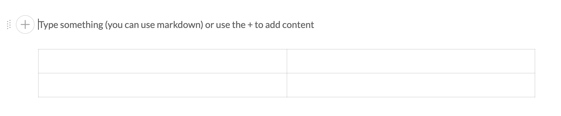
Table
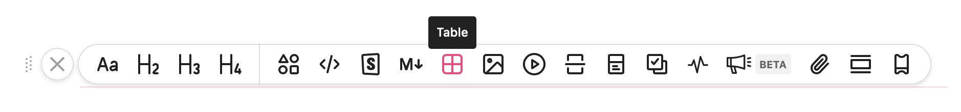
Add in a table to format text or images, make a list, or create alternative page layouts. You can add columns and rows to ensure all your content is organized. Row and column outlines can be hidden from viewers. You can use tables to create component status pages and changelogs.
Image/GIF

You can upload an image or a GIF into your documentation to add some more color or a more detailed explanation for your viewers.
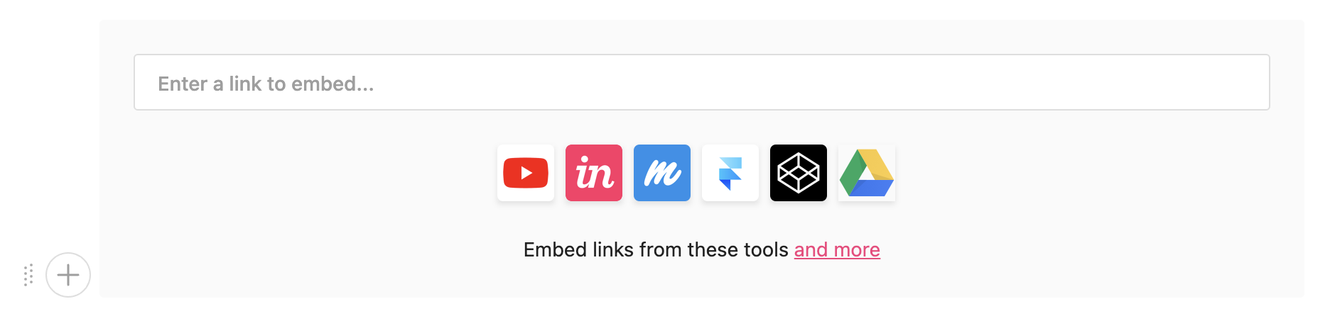
Embed

Embed using the embed block, including prototypes from Figma, Adobe XD, Axure, Marvel, and Protopie, as well as Github markdown files, videos, project management presentations and trackers, and other tools.
Divider
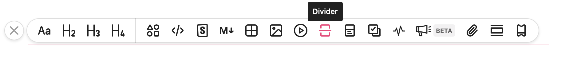
Insert a divider to break up your content for easier viewing between different blocks or to create separation on your page.

Shortcut tiles
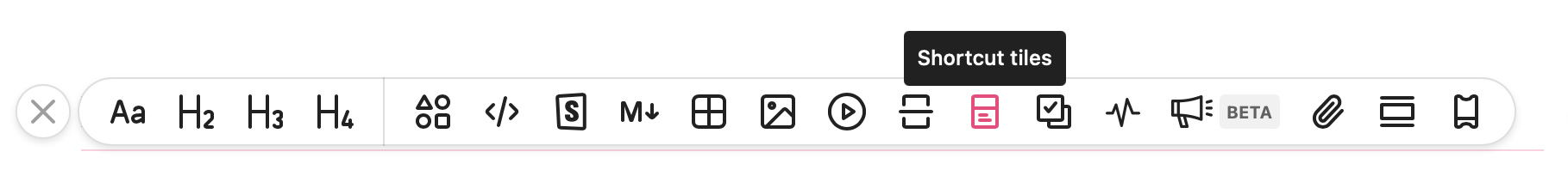
You can add shortcut tiles anywhere in your styleguide. These can link to other parts of your styleguide or to external links.
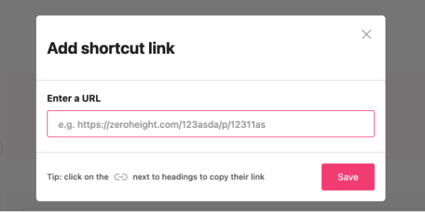
You can enter a URL and a cover image for each shortcut tile to help viewers navigate your documentation or link out to other resources.
It is also possible to adjust your shortcut tiles to be full width, three-quarters width, half width or a quarter width. You can also adjust the height to three pre-set heights (small, medium, or large).
Rules
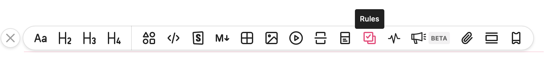
Our Rules block consists of do’s, don’ts, and cautions. These are a staple of any good design system documentation site. Use them to give examples of how particular components should be used and common mistakes to avoid.
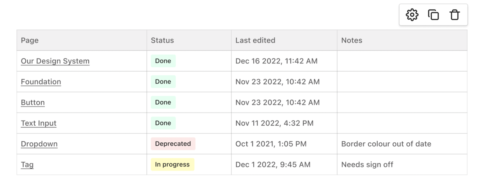
Status table
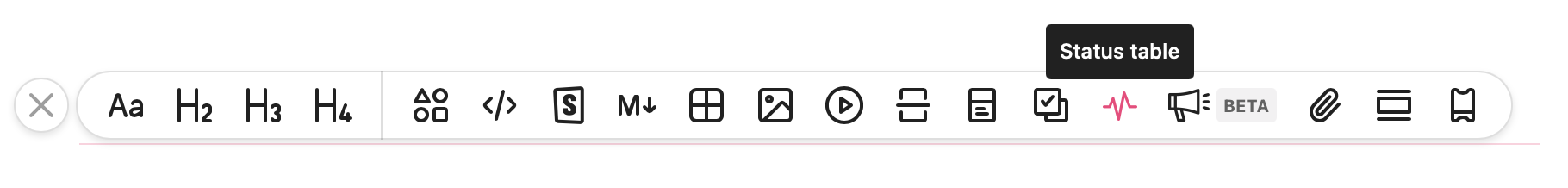
You can create a status table block to view the overall status of your components and styleguide pages for a convenient overview of your design system.
What’s new (beta)

You can share changes and new additions to your design system with the What’s New feature. This will allow you to get a summary of any new pages, edited pages, and deleted pages without manually tracking them.
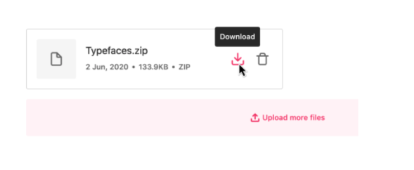
Attachments
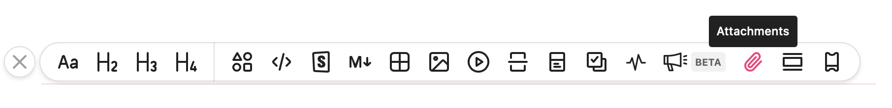
Attach resources (font files, PDFs, presentations, etc.) to your styleguide for viewers to download.
Callout

You can add a callout block to your styleguide to highlight important information. This could be useful for release notes, warnings, or other messages.
Design Tokens
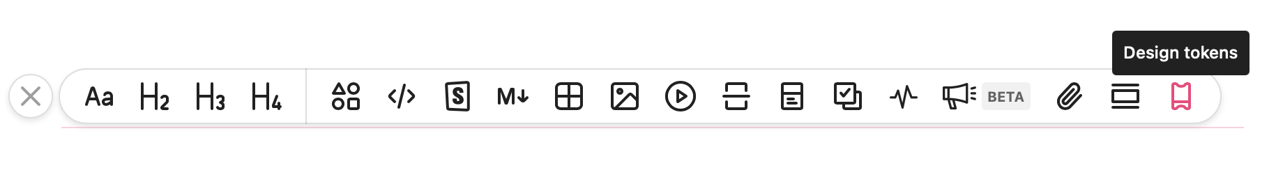
You can add or create a Design Token using our Design Token block. Tokens 2.0 enables you to edit how your tokens are set up and which styles are included. You can also create completely custom tokens that are currently not supported by design tools.
We also have a more comprehensive design tokens manager, which you can read more about here.