Display components in multiple themes
Brienne Wong
Your design system may contain the same components in different themes. For example, this could be because you have multiple brands that share the same components or you support both light and dark mode.
There are many different ways to support multiple themes in your documentation:
- Display themes next to each other
- Use tabs to toggle between themes
- Use a prototype to toggle between themes
- Use Storybook to toggle between themes
Looking for how to apply multiple themes to your documentation site? Check our article on creating and managing themes.
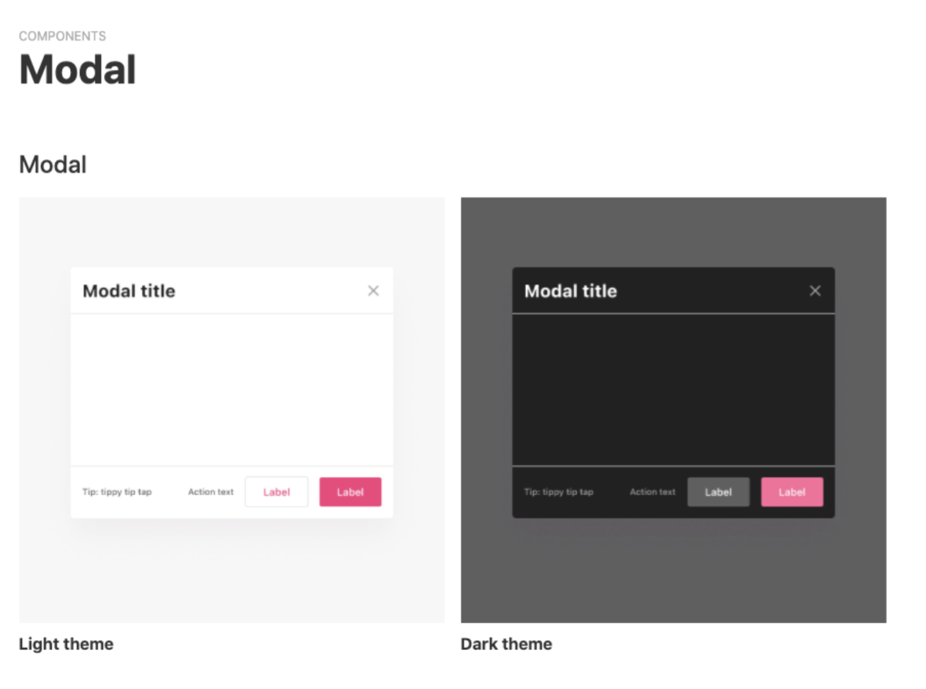
Display themes next to each other
The most straightforward option is to display the components side-by-side. You can change the background color of the design upload so that the design has sufficient contrast.
Use tabs to toggle themes
To display components in different themes, you can set up your pages to use tabs. You can toggle between the tabs from the top of the page and from the left navigation.

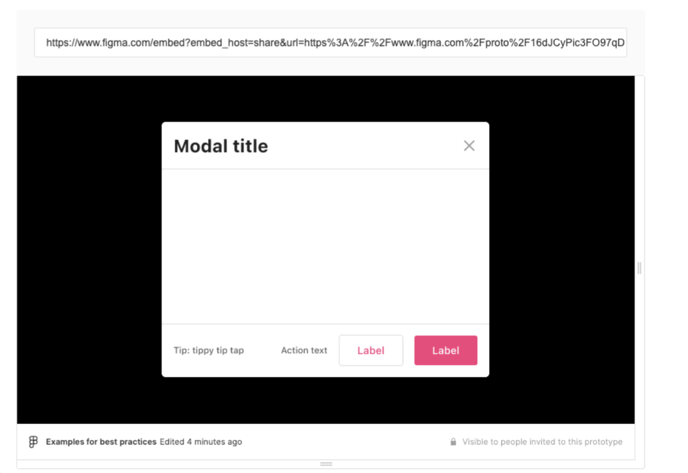
Use a prototype to toggle between themes
Creating a prototype is a simple way to swap between different themes. This can be particularly useful if the guidance in your documentation is the same across themes and the only difference is brand color and styles.
Firstly, create a prototype that switches the theme when you click. For example in Figma:

You can then embed the prototype in zeroheight by using the Embed option. Viewers of the styleguide will be able to click the prototype to toggle between the different themes.
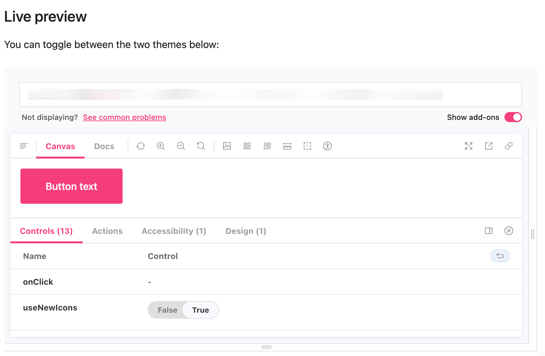
Use Storybook to toggle themes
This feature only works with embedding your Storybook into an iframe.
You can display themes in your Storybook so that viewers can toggle with the theme of your components. To display themes you need to turn on ‘add-ons’ for your Story.