How to organize your Figma files for your design system
Jules Mahe

Organizing files in Figma for your whole design team can quickly become messy, complicated, and a real struggle.
- What is the best way to organize your Figma files?
- What are the best practices for Figma?
- How should you handle screen organization?
- How do you manage your different teams/platforms/products with a consistent approach?
- Finally, what do you need to do to make Figma work with zeroheight painlessly?
Let’s see how to get you on track to organize your Figma properly, so you can focus on your work and (hopefully) leave the mess behind you once and for all.
Understanding what you have in Figma
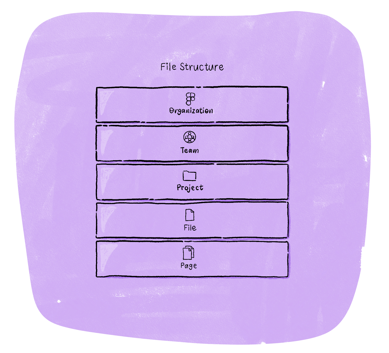
First off, to make sure everyone is on the same page, it’s worth defining how Figma is structured, what particular terms mean, and how this differs across their different plans.
First up, we have the way that files are organized. Let’s start at the top:
- Organization – This is a layer at the very top that is only visible and manageable in the Organization plan.
- Teams – These are collections of projects and where libraries operate at a default level.
- Projects – These are collections of files.
- Files – These are Figma or Figjam files where you do the majority of your work
- Pages – These are what you can have within your files to differentiate between different areas, states or modes of working
Next, we have the main elements that make up your design system files:
- Libraries – These are a type of Figma file with a basic publishing workflow that allows for shared styles and components.
- Components – This is a reusable design that can be centrally managed and reused across your design as instances. A single component can have defined variants, and some properties can be overidden at an instance level. If you make changes to the base component, this will then cascade through the instances once published.
- Styles – Styles are predefined properties, including colours, fills, strokes, text, effects and layout grids.
Organizing your design files – Teams and Projects
Choosing the right plan
Before we get into design system-specific tips, it’s worth looking at the general organization of your Figma setup. One of the significant challenges with any structure, no matter the tool, is knowing the design process: which design files are in progress, which ones are explorations or tests, which ones are outdated or deprecated and which ones actually reflect the final product. There are some ways you can organize your Figma set up to help make this easier for people within your org.
Organization plans
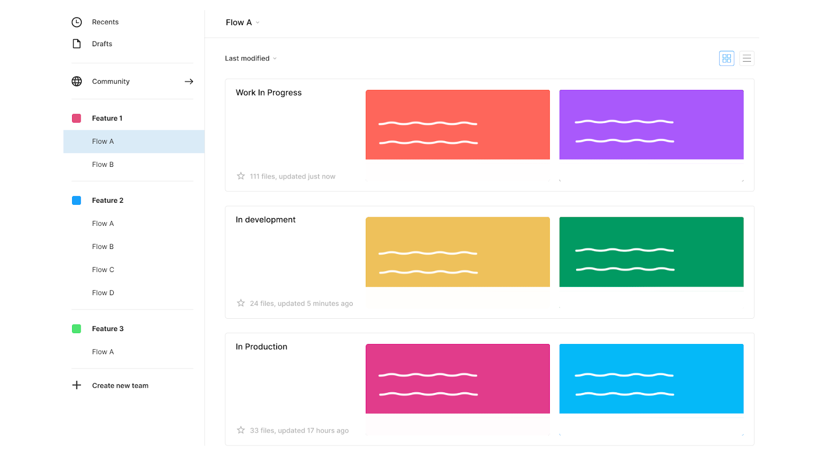
If you’re on an Organization plan, I really love the way that Spotify organizes its design files. That is, they use the Teams feature to split out the different product areas or teams within Spotify.
This then allows them to have separate projects for ‘Work in progress,’ ‘In development’ and ‘In production.’ Because you can have multiple design files in each project, this means that there’s space for everyone to work in the open, and it’s really easy for anyone coming in to know what to expect when looking in each project space. This also allows for granular permissions across projects and teams, which is really handy when you have a big design org.
Personally, I think this approach works really well if you have more than 5 or 6 squads working on your product.
Professional plans
If you’re on the next tier down in Figma, then the above model is harder to manage, as you don’t have a central place to manage all of your Teams. In saying that, you might also have a much smaller org, so you may not need loads of different teams. In this case, I’ve found having two projects per squad, one ‘work in progress’ project and one ‘in development’ project works really well. The ‘work in progress’ project can be a messy sandbox area for designers to explore and mess about. The ‘in development’ project is where files are tidied and readied for development and to put in the design system. In previous orgs, we also had an ‘in production’ project that had very clean files to reflect what was currently in the product. Although keeping these up to date was always a chore.
If you want some extra level of categorization, we found that using an emoji legend helped to give people a ‘heads up’ view of where the file was at. 🔎 for early exploration ✍️ for work in progress, 🥊 for in review, 🚀 for ready for development. This way, people know what they’re looking at straight away without diving into the file.
Starter plans
Finally, the starter plan. If you’re using the free version of Figma, there’s not much you can do from an organization or design system point of view. We’d really really recommend upgrading to one of the paid plans.
The correct setting that fits you and your design team
Whether you are a start-up, a company, or an agency, the way you organize your Figma may be very different depending on your design process, your design team, the way you make iterations, prototypes, and more. Use the Teams, Projects, and Files architecture to configure the best way of organizing your teams to make them feel more at home. These suggestions require an Organization plan and are made as a starter configuration. It’s up to you to improve and make it yours in the end.
Product configuration
Working on a single product is an excellent way to display all the features at a glance. Use the Teams to organize your features so that your team can access them quickly. You can then use the projects to specify what is WIP, in development and production.
Company configuration
A step above the product configuration, you can use the Teams to display all your products and Projects for features here. In Files you can specify whether they are WIP, done or any other status. You may at some point feel too constrained with this configuration. If so, it might be the right time to consider having multiple Figma Organizations for your company.
Agency configuration
Of course, we understand there are agencies using Figma. We recommend using the Teams to organize all their different clients. Browsing clients directly will make it easier to look for a project. Organize the different client projects with the Projects feature and if you feel you’re missing some hierarchy, well, maybe your client needs their own Organization plan and to stop using your plan.
Multiple platforms
If you have multiple platforms (web, iOS, Android), you may consider using the Projects to specify each platform and add WIP, in development and production directly in the file’s name. You could also split the teams by platforms (Product A- iOS, Product A – Web…) if it helps you. Use these best practices as guidelines and improve your specific organization and workflow from them.
Organizing your libraries for your design team
Small file sizes with cascading libraries
One of the biggest points of potential grief, on both the Figma and zeroheight sides, comes with large file sizes. You may wonder, how do you handle multiple documents in Figma? Or how do I organize my project files? As soon as you start creating libraries with 100s or 1000s of components, everything will lag. Not only will editing your design files in Figma be a nightmare, but you’ll also run into problems on the zeroheight side when our servers try and keep your files in sync.
One of the suggestions we make is to split your library files out into multiple design files. The easiest way to do this is to cascade your libraries down. Starting at the top, if you have a small product and/or a simple organization team structure, put in styles and components used universally across all teams, prototypes, and platforms. However, if you’re starting to have a lot of products, you might consider having an external library for styles only (eg. colors, fonts, shadows, icons…) that is detached from the component library. These will likely be your base brand styles. If you’re familiar with design tokens, this is the level we’re talking about.
This is especially important if you manage different themes (light and dark mode, for example). That way, it will be easier to manage with outsourced styles and make a switch from one theme to another. From here, cascade libraries down into whatever makes sense for your org. For some, it will be individual team libraries (such as your products or squads). For some, it’ll be a platform split (like iOS, Android, and web). For others, it may just be product design and marketing. There’s no hard and fast rule as to what’s right, so it’ll probably take some analysis of how your design teams work to make sense of it.

Not only will this make your design files faster and help your design team make simpler iterations, but this should also make the working environment a lot easier to use, as folks will only have to switch on the asset libraries they’re using on their projects and prototypes.
Component and library status
Similar to how we suggest breaking out ‘work in progress, ‘in development’ and ‘production’, we suggest doing the same for your design system libraries. This ensures that when you’re publishing your libraries, it’s manageable, and you can be relatively confident that whatever needs to be published is ready to go out to the wider design org. However, with Figma’s recent launch of ‘branching,’ we can see the need for separating your work in progress and development files becoming less and less, especially if they make old branches and commits readily searchable and available.
However, to make sure that communication is clear, one suggestion is to have some form of status on your libraries and components. This can either be as simple as a traffic light system that says whether a component is 🔴 Not in code 🟠 In development 🟢 Live or ⚪ Out of date/deprecated, or could include the version number, aligned with the versioning system you use for your documentation and code. Version numbers are also helpful on libraries as a whole if you are ahead or behind the documentation and the code.
Page per component
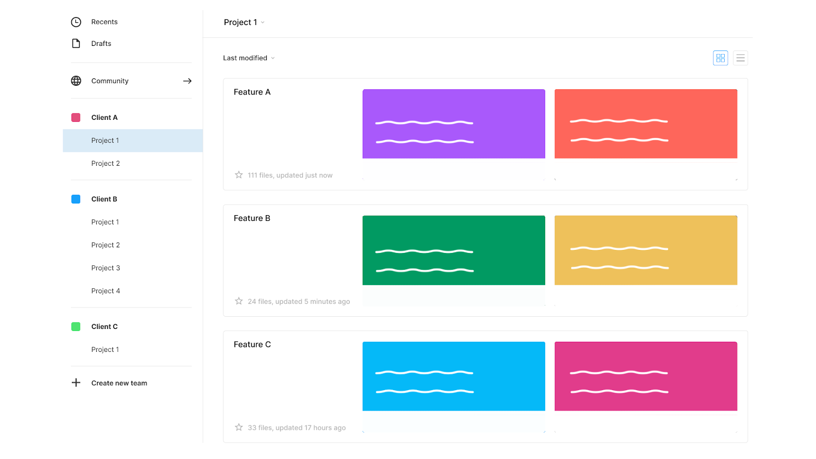
How do you organize components in Figma? Keep in mind, helping your users find the suitable component should be straightforward. This is why having a clear structure on your components page matters. If you have a Figma file for your components only, we recommend having a consistent system between your Figma files and your zeroheight (or any documentation platform you use). Use your pages like categories, and fill in your components in artboards to have a clear overview. Here is what it could look like:

Organizing your design files for your design team
Emojis for shorthand
As mentioned a couple of times before, emojis are a great shorthand to use alongside names to give people a heads-up view of status. These can be done on projects and files and on individual pages within the Figma files. In terms of what your emoji system could be, the best way to decide is as a team, but here are some suggestions:
- Designs are done and ready to be shipped: ✅ ☑️ 🚀
- Editing or in progress: ✏️🛠🖊 🖋 ✒️ 🖌 🖍 📝
- Archived: ⌛ 🛑 ⛔️ 📛 🚫❌
However, a word of caution about using emojis. It is a great way to make your design files and projects visual, but do not overuse them. This is particularly true for layers and component names. First, hand-off tools may not like these emojis (zeroheight’s search function isn’t a fan). Also, from a developer’s experience, it is more useful to have proper naming rather than a visual one.
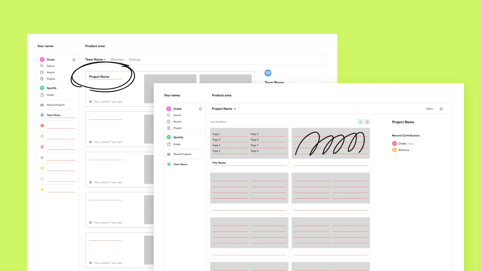
Thumbnails
Having a custom thumbnail helps to communicate better. Feel free to create visual thumbnails for your design files and prototypes to help your users understand what they’re looking for at a glance. Use thumbnails to display information, status, or any other additional information useful for your team. This is also an excellent way to get more visual consistency, and it’s easier to read. Everybody will thank you for this. Here are some plugins to help you generate a cover for your files:

If it doesn’t exist, build it
Another benefit of using Figma is how big and powerful the ecosystem is. If using external plugins to improve efficiency is an option for you, keep in mind – the simpler your Figma files are to use, the better. Moreover, maintaining a whole Figma organization is hard enough, don’t rely too heavily on external solutions, as you may become too dependent on updates and maintenance. However, an interesting option would be to build your own plugins to maintain your prototypes and your system and speed up your workflow. It’s an excellent way to have exactly what fits your needs and control the evolution and maintenance. And as a bonus, if it might help the community, feel free to share it and get visibility!
Closing thoughts

There is no one ideal way to organize your Figma files, and you may find another approach that will be a better fit for your own organization. But if you need to pick only a few tips from this article, here are our key takeaways:
- Keep it simple and do not make things too complicated in terms of naming, plugins, or readability. It has to be both easy to maintain and easy to use.
- Split your design files as much as possible. Keep your components apart from your projects, as well as your styles.
- Keep the same naming convention everywhere: in your Figma files, in your zeroheight, when you talk to your colleagues, etc.
- Choose the right setting for you whether you are a product, an agency, or any other complex organization. The way you organize your Figma needs to represent the way your design teams are organized.
I hope that’s sparked some ideas to help you visualize how to set up your files and teams in Figma. It’s all particular to your company and the way you are organized, so you may find another approach to be more suited to your organization.
And to help you get started, here are some Figma templates files you can use: