Setting your design files up for success with zeroheight
Michelle Chin
Out of the box, you can upload your design files into zeroheight. Messy files where frames, components, and layers aren’t intentionally named will work. For example, if you want it to pull in “Frame 10212,” you can do that without a problem. But messy design files often cascade into more significant issues, less adoption, and more frustrations. The goal is to get your design libraries, code libraries, design files, and design system documentation to work as seamlessly as possible. This will help make things easier to maintain and ensure everyone is speaking the same language (literally).
This article covers best practices so your design files work well for your teammates, new hires, and your documentation site. Most of the guidance is design tool agnostic, but we’ll specify anything unique.
Let’s get started!
Use one (or a few files) for all your design system needs
With zeroheight, there’s no need to create a separate UI library file to connect with your documentation site. Instead, you can link your UI library file to zeroheight. This means you’re only updating one file and all naming conventions stay the same.
If your design system is broad or supports multiple brands, there might be more than one UI library file. The idea remains the same, link those files to zeroheight for seamless maintenance.
Label all your elements
Any time you create an element – a rectangle, a component, a type style, a frame/artboard, etc., take the time to label them with a proper name (e.g., primary button). UI kits get complicated quickly; if you don’t do this as you go, things will get messy, and it’ll be harder to go back and make changes.
Labeling your elements makes it easier to:
- Communicate with teammates
- Organize components and styles in a meaningful way
- Find things quickly when searching in your libraries or zeroheight
Here are support articles for naming elements:
- Naming components in Figma
- Renaming layers in Figma
- Working with layers in Adobe XD
- Organizing symbols in Sketch
You can use your naming conventions across your design, code, and design system documentation. Naming conventions might change as you evolve things, but if you have your elements labeled, the changes shouldn’t be too taxing. Learn more about naming conventions.
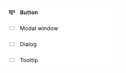
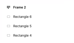
In the example on the left, the layers have understandable names. In the example on the right, the layers are not renamed with meaningful names. It’s difficult to understand what they are and how they to use them.
Take advantage of reusable elements in design tools
Reusable elements are the building of a design system. In Figma and Adobe XD, they are components; in Sketch, they are symbols. If you’re designing a screen, you can add a component or symbol to your design. This alleviates the need for you to create elements individually every time and speeds up your workflow. It also allows you to make sweeping changes in case something happens, for example, if the brand color changes from blue to purple.
As you’re creating design system elements, make them components or symbols. These components or symbols become part of your library that your designers use. When creating complex components, use existing components to build those components. For example, if you have a dialog box component, use the button components instead of creating new ones. You can also link this file to zeroheight, so it gets leveraged in your documentation. There’s no need to create a separate file just for zeroheight!
If you’re new to creating and leveraging components or symbols, here are some links to get you started:
- Creating components in Figma
- Creating and using variants in Figma
- Creating components in Adobe XD
- Working with nested components in Adobe XD
- Creating symbols in Sketch
- Creating nested symbols in Sketch
Also, leverage the ability to create styles. Styles are properties that you can define, then apply to an element. For example, you can make type styles for your product’s headings, body copy, and captions. You can create styles in Figma, Adobe XD, and Sketch. (include links to how from their support pages). When you create styles in your design tool, you can also have them pulled into your documentation site. Like with components and symbols, no separate file is needed.
If you’re new to styles, here are some helpful articles:
- Styles in Figma
- Managing document assets in Adobe XD (includes color and character styles)
- Text styles and Layer styles in Sketch
Organize your elements
It’s helpful to add some level of hierarchy to your component organization. Not only will this make it easier to find components in your library, but it’ll be easier to find things for maintenance. Figma, Adobe XD, and Sketch all have ways you can add some organization by grouping similar items into folders. (provide links)
- Naming and organizing components in Figma
- Working with layers in Adobe XD
- Organizing symbols in Sketch
Other helpful tips
Organizing Figma files
How you organize your design files is up to you, but if you’re looking for a recommendation, check out our article, “How to organize your Figma files for your design system.”
Migrating from one design tool to another
We recommend you recreate your design system components from scratch if you’re also switching design tools while using zeroheight. Even though a design tool usually allows you to import files from another design tool, it’s often messy. Instead, designers find it much easier to recreate the file from scratch in the new design tool. While this seems like a lot of work, it’s often less than finding all the things the importing process messed up. Starting fresh ensures that things are set up correctly in your new file with no hidden bugs or issues. Designers can often quickly create these files since they’re not spending time trying to make design decisions. Instead, they’re just focusing on making elements. Recreating the work is also great practice if designers learn how to use the tool for the first time.
On your way to a great start!
By following these best practices, you and your team will be on their way to creating an easy-to-manage design system. Your libraries will be easier to maintain and keep in sync with your documentation site, your designers will be able to find what they’re looking for quickly, and new hires will be able to jump into designing rapidly.