How to define your design system’s flexibility
Jules Mahe
If you’re reading this, you are probably already convinced that not all design systems need to ensure strict consistency across all projects. If not, here is our blogpost about finding the right balance between consistency and flexibility for your design system.
But what is design flexibility in systems and how do you define your design system’s flexibility?
To identify your design system’s foundations and which aspects should be mandatory and optional for your brand, here is a workshop you can run with your team.
Set-up
Who?
This workshop will be more efficient with people who know how the brand works and can decide. This is why you should invite all leaders and “makers” in charge of the brand and your design system: designers mainly but also product managers, marketing, social media, communication… anyone involved with the brand, but especially people who can make decisions and/or have experience using and applying the brand on the projects.
How long?
Allow 4h to be comfortable. Any shorter, and you will be rushing. Any longer, and you’ll probably lose steam by the end of the workshop, and boredom will creep in. Don’t forget to add in a break at some point. You can also split this workshop into 2 sessions if it’s easier for you and your team.
What do you need?
This workshop works fine both online and offline. Whatever your context is, here is what you need to prepare in advance:
- Screenshots and visuals from everything that is concerned by your design system and/or your brand (marketing website, apps, internal products, prints, merchandising, partnerships, social media visual content…). Don’t hesitate to include poorly branded projects or even projects where the brand is not visible. It will help you understand where your brand should stand out and where it can be more or less visible.
- A list of all the patterns from your brand such as colors, fonts, icons, shadows… a suggestion list is provided below but feel free to add more if you have specific patterns related to your brand.
Step #1 – Identify your brand’s essentials
Once you have arranged all the visuals of your products in a clear and readable way, add an area next to them that includes all your brand patterns. Then ask each participant which patterns are essential or missing for them to identify the brand on these visuals. You can also leave a space for comments so they can detail why they voted on these patterns if necessary.
Here is a list of the most recurring patterns you’ll probably need, but feel free to complete this list depending on your brand’s needs:
- Logos
- Colors
- Fonts
- Icons
- Illustrations
- Shadows
- Radius
- Layout
- Spacing
- Tone and voice
One suggestion is to display every pattern on a sticky note and letting people vote if it’s an essential or a missing pattern to them.

Once you have reviewed and voted on all your screenshots, gather all the votes and rank the patterns. That way, it will help you take a first look at the most important styles for your brand. Plus, it’s an excellent way to get some sort of a backlog/roadmap about which patterns you should focus on for documentation, for instance.

Small tip: it can take a lot of time to count and gather all the votes. Ask all the participants to participate and help you count the votes. Assign them each a pattern and they should count the votes for that pattern. This will save you time and make everyone feel engaged. You should count both of the votes for the essential and missing patterns. For example, if the color pattern has one essential vote and one missing vote, count 2 votes. The idea is to understand what are the most important patterns for the brand to exist.
Keep this ranking aside, it will be useful for later.

Step #2 – Understand your brand’s criteria
Now that you know your brand’s essentials, it’s time to define the right criteria for your brand to be well represented. For this, we will use a 3D matrix so we can have a better overview of how different projects use your brand.
You will need a list of your project’s names (which you used for the ecosystem audit with the visuals), and an empty 3-axis matrix with these criteria:
- Target critieria: for whom are your projects: internal only, logged-in users, public audience…?
- Product criteria: what is specific about these projects: use (marketing, internal tool…), technologies (web, app…), teams (location, department…)…
- Brand degree: how much do you think this project should be branded?
You need to conduct this second step in three phases:
- Place the projects with the first two criteria (target and product) for starting so you can better understand how your projects are used.
- Once it’s done, adjust these projects by extending them along the brand degree axis. Make sure everyone has the same vision about how close or not to the brand these projects should be.
- Use colors to highlight projects and better visualize heir relationship with the brand degree.

Remember that this is not a snapshot of your current situation, but more an aspiration of how these projects should be branded. This last part is essential before moving to the next step.
Step #3 – Adjust your flexibility
This final stage brings together all the work of the previous steps and should allow you to check that everyone is well aligned and coherent with the choices that have been made. It is an important step and it can be complex, so I’ll divide it into multiple sub-steps.
To complete this stage, you will need to use this family matrix. It usually works with these 4 categories but don’t hesitate to adjust it if necessary; you may only need 3 for example.
The idea is to associate a certain level of consistency for each category:
- Twins: the projects must be perfectly aligned with the brand and thus respect a certain number of criteria (most probably all of them)
- Siblings: projects are very similar but may have distinctive features
- Cousins: the projects are not very similar, but there are some common elements nevertheless
- Neighbours: the projects have almost no connection with the brand (most probably none of the patterns or the logo only)

Match the projects in the right columns
Place the projects from the 3D axis using the positioning you completed in the previous step as a starting point. Identify the appropriate category for each project on the brand degree axis. For example, if the project is located in brand++++, place it in the Twins column. By reviewing it, you will gain a better understanding of what should be the focus of your projects. Keep in mind that it’s not definitive and you’ll probably have to make adjustments later.

Complete the patterns
Then, take the ranking of the core elements of your brand that you established in step one, it will help you to place each pattern in the right column in the family matrix. The more a pattern got votes in the ranking, the more it has chances to be mandatory for your brand.
For each patter, define if it belongs to one of these categories:
- 🟢 Mandatory: this pattern must be included in the project; it is not optional
- 🟠 Editable: this pattern is important for the brand but can be modified. In that case, try to be specific and write what you can edit with this pattern. For example, if it’s about colors: can you create a new color or only use one from another palette?
- 🔴Not included: this pattern shouldn’t be used in the project
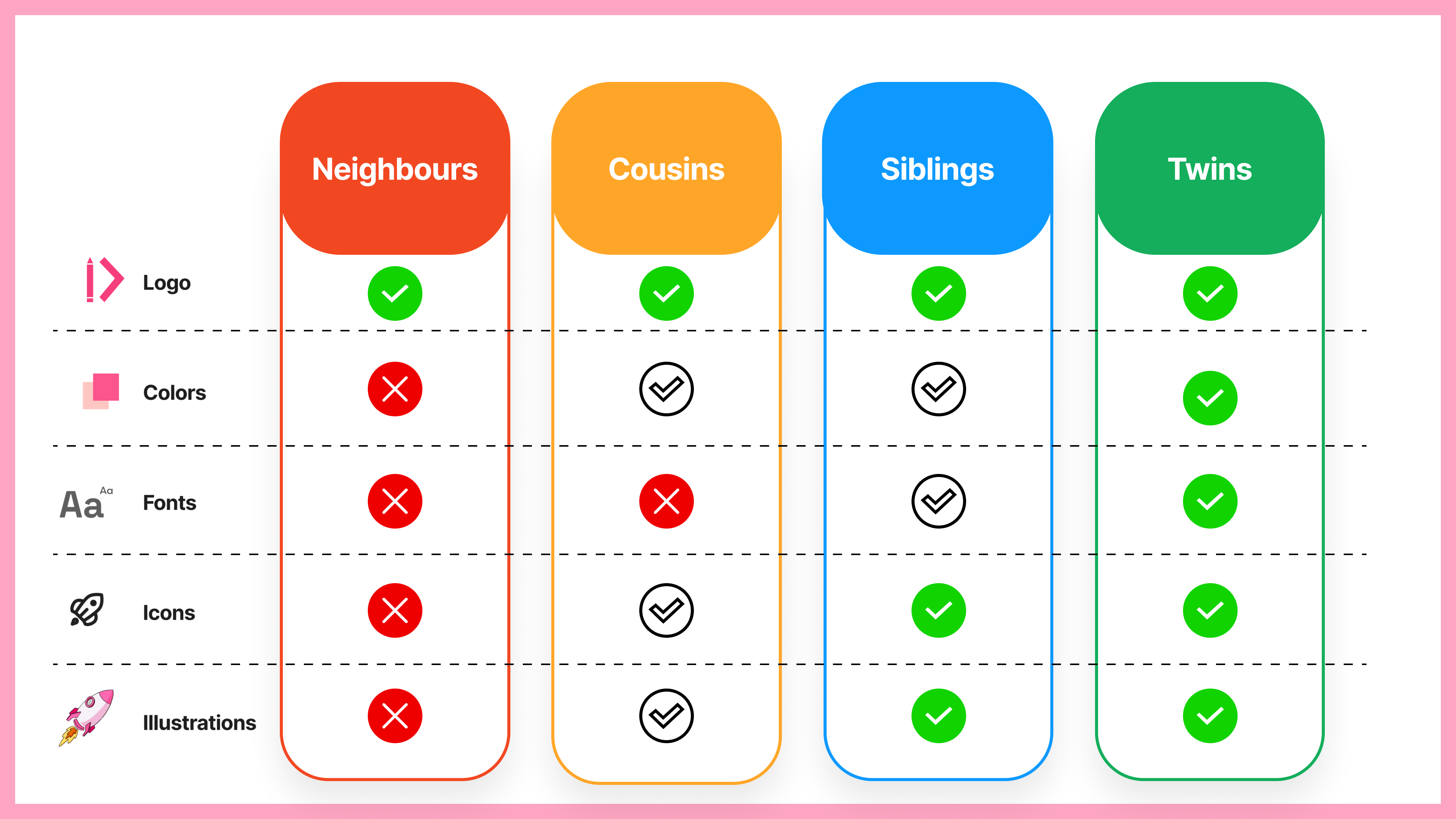
Having trouble filling in these columns? For twins, make all the patterns mandatory, then make the top 5 from siblings mandatory as well, the same for cousins with the top 3, and for neighbors only make the logo mandatory. It will probably not fit your needs but will help launch discussions and you can adjust these decisions.
This step can take a while because it will trigger a lot of debates. But this is a good thing; this is where the magic happens and you start aligning everyone with a common and shared vision about where your brand should be.
Define critera
Once you’ve completed all the categories with the right patterns, use the 3D matrix from step 2 to fill the targets and use sections below each category. It should led you to define how and when a project belongs to a category. For example, should a twin project always be for a public target and marketing use? Are you comfortable with neighbor projects being for internal use only? Should a brother project be a tool-oriented project?
This is the kind of question you’ll probably be facing and it will be time to adjust some criteria to match how your brand should be applied. Of course, you can have the same criteria in different categories, it’s up to you to define what is the best for you and your brand.

Finally, to ensure everyone is aligned, reuse the list of your project’s names at the top. Check if each project in each category fits the brand’s essentials and the criteria. This is the final check to see if you are coherent and aligned with everyone. Does this project need to follow all these patterns? Is that ok to consider this project in this category because it has these target and product criteria? At this point, you should only have very few adjustments as you have already defined all your brand patterns and conditions in the previous steps.
Next steps
Congratulations! You successfully built solid foundations for your design system by defining your brand’s essentials but most importantly, you aligned your team with the same vision about the design system. There were certainly a lot of interactions and discussions during this workshop, and some things were probably a bit upsetting for some people. This is quite normal, and you are likely planning to adjust existing projects to align with the outcome of this workshop and your brand.
In order to get the most out of this workshop, it’s highly recommended to write some brand guidelines about how to apply the branding principles to the projects. Feel free to use the family matrix or anything you find helpful to make these rules more visual.
If you want to go further, you could build a decision tree (using a dynamic form like Typeform, Google Forms, Microsoft Forms…) to help your team understand to which kind of project they belong and which patterns they need to follow to apply the brand the right way. Use the criteria as questions to guide them and share the patterns to follow as a result. You can even embed one of these forms directly into zeroheight to make this step the most integrated possible.
 This workshop is excellent when you start with your design system, but it is also possible to run this workshop even if you have already started. It’s a good way to realign everyone and help your team better use your brand and design system.
To help you get started with this workshop, we’ve made this Figjam template that you can reuse and adapt to your needs.
Feel free to use it and share it 🙂
